2013년 5월 30일 목요일

Faber-Castell Ads

I vividly remember the day when my father gave me a new set of Faber-Castell colored pencils. As a kid, I bounced up and down excitedly on the bed. Still, even looking at dozens of colored pencils brings joy to my heart.


As you may know, Faber-Castell is a German stationery manufacturer.
They tout the top-of-the-line range of “Artist Color Pencils.” 
The ads I brought today show us how real and natural their colors are.


The images they are using are definitely eye-catching.
However, the dog combined with the brown colored pencil looks a little bit awkward.
Using foods like the eggplant and banana seems better.


The next series of ads are also fun. Neat and effective, aren’t they?
Can you find where the colored pencils are? The colors are so natural that we cannot even distinguish Faber-Castell’s colored pencils from the sky.


Now, there are some famous paintings.
They are masterpieces of Vincent Van Gogh and Edvard Munch.
At first, you might think what they have to do with Faber-Castell.
Well, take a close look, and you will see they are made with colored pencils.
By using well-known paintings, Faber-Castell effectively shows us the distinctive features that they have a wide range of colors and their products are for artists’.


Finally, let us take a look at their eraser ads. They are creative as well.
I guess the message they wanted to deliver was erasing also can be a brilliant idea.
Faber-Castell defies the stereotype that only drawing matters.
Be an innovator with Faber-Castell erasers!


2013년 5월 22일 수요일

Greenpeace Ads + WWF Ad


Greenpeace. Their ads are as creative as WWF’s.
I brought a series of ads which is unusual but creative.
Let us take a look at them first.


This kind of approach is quite unique.
On the surface, they look like pages torn out of a children’s story.
However, after reading through the scripts, I guess many of you will be shocked by a sting in the tales. The stories are somewhat intimidating as well as cruel!
Baby squirrels, rabbits and birds meet their doom by the avarice of humans.
In reality, countless forests are being indiscriminately devastated in the name of development. Nevertheless, not many people are aware of how many creatures are being sacrificed in the process of logging.


As an example out of many, a few weeks ago, I saw an article of the koalas who had lost their habitat due to forest clearing. Luckily, before cutting down the trees, they were migrated to another forest. However, some of them came back to the old one they used to live as they have a homing instinct. Those who witnessed that scene said that one of the koalas had been sitting on the ground in a daze for hours. The picture of it made my heart ache. We really need to take some action for peaceful coexistence.

Back to the ads, needless to say, storytelling is truly a powerful way to deliver a message. These Greenpeace ads prove it perfectly. Using little creatures that most people adore, Greenpeace effectively enlightens us and evokes our sense of sympathy even though kids might cry over it.


Plus, I found this while surfing through the Internet.
Neat and great! WWF’s ads never disappoint us.
It will take only a few moments to realize that a lion, the symbol of MGM has disappeared.
The copy says, “In twenty years time one third of the world species may have disappeared. When are you going to do something?” A bit threatening but definitely touches our hearts.
Unless we take more steps to conserve the environment and other species,
we may not be able to hear the roar of the MGM lion.

Save our earth, and save our animal cousins!

2013년 5월 16일 목요일

Exaggerated but Fun Ads

Today, I will cover some advertisements which are exaggerated
but effectively emphasize product features.


The first one is an ad for rolls of paper named Scott.
The image shows us directly that Scott’s paper towels are truly absorbent.
With only a piece of paper towel, you are able to clean your spilt coffee perfectly.
It is also brilliant that the piece of paper towel looks three-dimensional by adding a line.
It seems that the coffee is going down a drain.


Look at that. Isn’t it funny?
In thick grass, only the referee’s hand holding a red card is shown.
The second one I brought is a lawn fertilizer ad from Germany.
In English, the slogan says, “Quicker. Taller. Denser.”
It clearly highlights the great performance of the lawn fertilizer.


The next one posted above is advertising slim jeans by Levis.
It is true that the ad is somewhat exaggerated.
Nevertheless, it addresses its feature efficiently with a few lines and Levis labels.
The message is clear enough, not to mention it has simplicity.


Oh, somebody has stuck in the gutter after drinking Slim-Fast, a diet drink.
Only the cap remains. Exaggerated but fun!


I think it is a truly splendid advertisement.
At first, I thought it was advertising some kinds of pins.
Actually, it is a hair gel advertisement. They are saying that with their product, your hair can be thick and straight enough to unlock the handcuffs!

Sometimes exaggeration used in ads stirs up our interest and accordingly, makes us remember their products better.


2013년 5월 9일 목요일

Diesel Ads

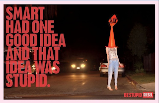
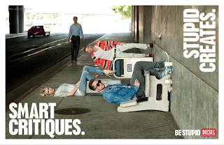
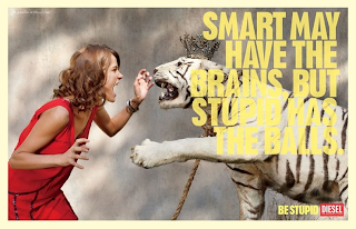
Diesel, a global fashion brand, has been successful at promoting a lot of unconventional advertising campaigns. Among them, I would like to introduce my favorite campaign.
“Be Stupid” is the slogan of the campaign I brought today.
Today’s society requires more people to be smart.
On the contrary, this campaign is telling us that we should be stupid. How funny is it?
Of course, it does not mean that we should be literally “stupid.”
It says that being a risk taker sounds challenging, but it certainly is worth it.
Thus, we need to be more audacious and creative.


The images used in the print ads are perfect for their copies. Some are even hilarious.
Here I borrowed some lines of the copies of the advertisement.

“Don’t be stupid.” It’s the crusher of possibility.
To be stupid is to be brave.
The stupid isn’t afraid to fail.
The stupid know there are worse things than failure… like not even trying.
Remember only stupid can be truly brilliant.

These copies are truly thought-provoking.
I wholeheartedly agree with that.
What we need is to think outside the box and be brave.
We should keep asking ourselves “What if…?” and “Why not…?”
Stupid ideas sometimes seem reckless and without logic.
However, that is what makes it brilliant. Indeed, all the fun ideas derive from stupid ideas.
Playing safe is not likely to be a breakthrough.
Indeed, so many people are not even trying as they are afraid of failure.
Consequently, they lose their opportunities to accomplish and create new things.
I guess sometimes it would be better to muster up the courage and dash for a goal.

I also brought the video version.
It is as great as the print ads. Enjoy and be stupid!


2013년 5월 2일 목요일

Lego Ads

As I walked past a Toys R Us this afternoon, I saw a lot of parents holding Lego boxes in their hands.
I guess they were preparing for Children’s Day.
I believe almost everyone has fond memories of playing with Lego as a child.
Indeed, Lego was my favorite toy in my childhood.
Not to mention that I loved building things with it, I enjoyed destroying Lego castles built by my cousin. Back then, he hated me.
Reminiscing about the old days with Lego, I brought some Lego ads.
I would like to share their creativity. They are truly brilliant.


The first set of ads looks simple but somewhat confusing.
For a while, I did not know what the blocks are for.
I got a hint from the short slogan in the upper-right-hand corner, “Imagine.”
Right. Lego stimulates our imagination. The blocks are Donald Ducks!
The next one is pretty obvious. They are Smurfs.


There is another great ad whose slogan is also “Imagine.”
For me, this one was quite hard to guess.
There is only a block looks like a pipe on a wide blue canvas.
What does it mean? Take a wild guess!
Well, it is a submarine under the sea!
I think it is literally an amazing advertisement.


Next, I think many students may have done this activity in class.
However, instead of finding words, let’s find components of a spaceship!
What a fun idea!


With a paint work, the Braille guiding blocks on the floors became Lego bricks.
Like this, sometimes ads can be successful even without spending a fortune.

Lego ads are as fun as playing with Lego!


2013년 4월 11일 목요일

Coca Cola Ads

Who can resist the temptation of a glass of cool Coca Cola on hot summer days?
Coca Cola is famous for its fun ads not to mention its taste.
Today, I would like to introduce Coca Cola’s cool & fun ads.
There are three coca cola bottles.
Well, what do you think? Did you get the message immediately?
As you can see, these three bottles are slightly different from each other.
The first one is a black and white photo, and the second one is a color photo,
and the last one looks like a 3D photo.
In the lower right hand corner, there is a copy; 125 years at the movies.
From a black and white film to a 3D film, Coca Cola has been a great companion
when you go to the movies for 125 years.
This ad conveys Coca Cola’s history into simple images with effect.


The next ad is one of the series of “Open Happiness”.
The parts of the logo (Coca Cola’s “Coc”) seem like a smiley face. How brilliant!


These are for the Olympic Games. (In fact, Coca Cola has been a sponsor of the Olympics for more than 60 years.) The athletes are playing games with Coca Cola’s logo.
Like these, Coca Cola’s ads are strongly associated with its brand.
They are intuitive and powerful.
Coca Cola could gain its brand recognition by using its logo effectively.


+


While surfing the Internet, I found an interesting Coca cola campaign.
It was for the launch of the movie, 007 Skyfall. Buy Coca Cola, and be James Bond!
It is a truly great example of ambient advertisements.


2013년 4월 3일 수요일

WWF Ads

On March 23, did you participate in a campaign called "Earth Hour"?
It is a global campaign which encourages households and companies to turn off the lights for an hout to save energy. It is organized by World Wide Fund for Nature (WWF) and today,
I brought some of the brilliant ads of WWF. WWF is an international non-governmental organization which works for conservation, research and restoration of the environment. I think its panda mascot is pretty famous. Personally, I have always loved the logo, and tonight I found an interesting story about it.


When WWF had to create their logo, they wanted an animal which is on the verge of extinction and beloved by many people all around the world. In addition, the organization needed an animal that would be conspicuous in black and white printing. Thus, the giant panda was perfect for their symbol.


Not to mention the symbol, WWF’s ad campaigns are famous for their sparkling ideas.
Among them, these show us the seriousness of global warming.
You might have seen these on the web. There is a scoop of earth-shaped ice cream, and it is melting down. Just as the image, the ad tells us that our earth is melting because of global warming.


The next one also warns of global warming. The glaciers in the picture look like melting ice cream bars. In reality, the Antarctic glaciers are gradually melting due to climate change.


As you can see, climate change can make a polar bear and a seal homeless.
With simple images, they effectively alert us the danger of global warming.


This campaign is about conservation of wildlife. There is a picture of cute chimpanzee smiling at you, and a pop-up comes on, ‘Don’t Save or Save’. Similar to the previous one, a sea turtle which is an endangered species appears this time. Apparently, this series of ads has a strong emotional appeal. If possible, I would like to introduce more ads of WWF. They are awesome.

I became interested in protecting the environment after watching a movie, The Day After Tomorrow (2004). After watching the destructive power of nature, I tossed and turned in bed all night. We are helpless against the power of nature, and we don’t have any right to destroy natural environment. Thus we should be aware that it is high time to have to preserve nature.


2013년 3월 26일 화요일

Simple but Powerful Ads


Today, I would like to introduce some creative ads.
They are simple but powerful.


The first one is quite obvious.
It is simple but still powerful.
It is Beans & Beyond's coffee ad.
Since their product is extra strong, you can stay up late just like an owl in the picture.
Two cups of coffee and beans form an owl. Brilliant.
These days, I am juggling a lot of different things.
I used to be a night owl, but lately it is hard for me to stay up late.
I think I might need an extra strong coffee like that. 


The next one is a sugar-free candy of Chupa Chups.
Generally, ants gather on candies, but in this picture,
they are bypassing the candy because it is sugar-free.
Actually, I have tasted the one in the picture; Chupa Chups Cremosa.
It has a mild and creamy taste even without sugar. However, I prefer the original flavor.
I think It was more expensive than the original one.
                                         Isn't it ironic? Sugarless costs more.
At any rate, the ad is awesome.


The third one is Nivea's night cream.
How simple it is!
The product on a blue black background. That's all.
Beside the lid, a crescent moon-shaped cream appears.
No more words are necessary.


Last but not least, these are the ads of rice flavored Pringles.
Sushi, a bowl of rice, Onigiri (a rice ball) made with Pringles. Impressive!
The images are well-suited to the product.
I am a diehard fan of Pringles, but I haven't tasted rice flavored ones yet.

Most kinds of Pringles are usually salty, but maybe rice flavored ones are not.
 I think I should try them if they are sold in Korea.

Like above, pictures sometimes show everything.
They have got powers that words cannot express.